Papa Murphy’s:The Beauty of Real

New brand principles for a pizza brand that wanted to look like itself

Fresh Pan · TV

01The challenge

Pizza advertising often showed perfect pies and impossible cheese pulls.

Papa Murphy’s had a different story: you bake it at home, use real ingredients and make a little mess. The brand’s visual style needed to feel that way.

02The insight

The joy of pizza is in the mess. Real beats perfect.

03The work

I led a visual strategy that gave the brand a more honest look, using art direction and a set of core brand principles.

It helped Papa Murphy’s stand apart from the familiar conventions of pizza advertising.
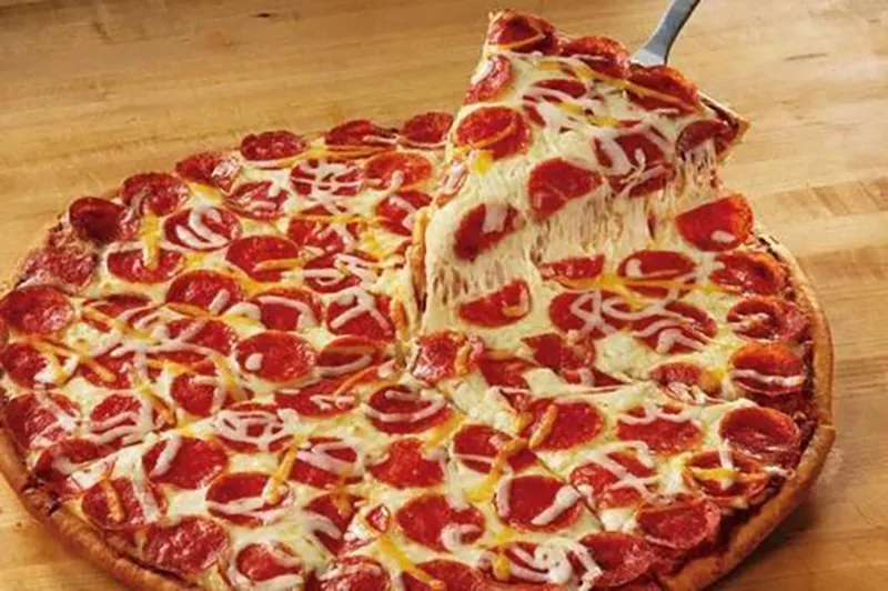
Before: a glossy pepperoni pizza with a slice lifted in a long, perfect cheese pull.
Before
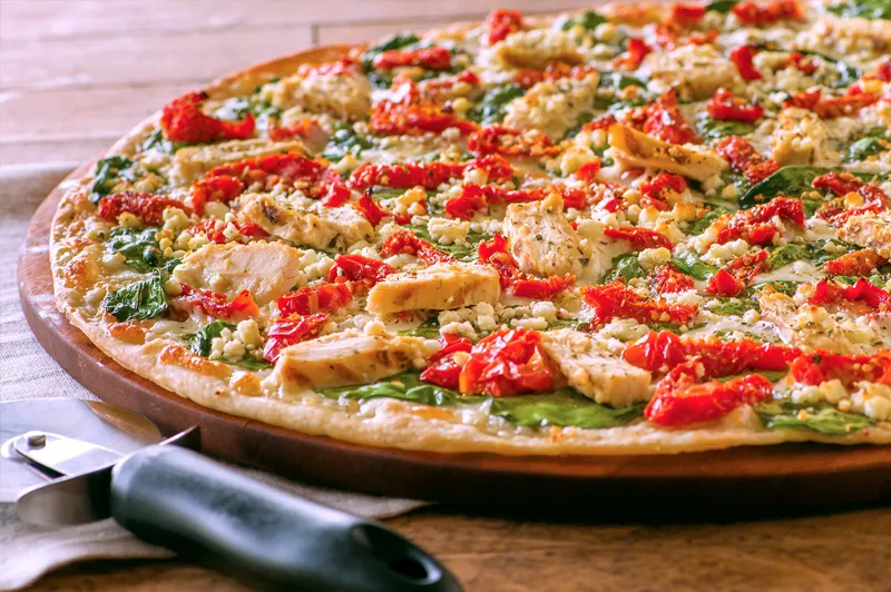
After: a chicken and roasted pepper pizza on a wooden peel, shot in natural light.
After
Bacon Bacon Bacon · TV

04What it left behind

The work became a set of brand principles for future shoots and campaigns.
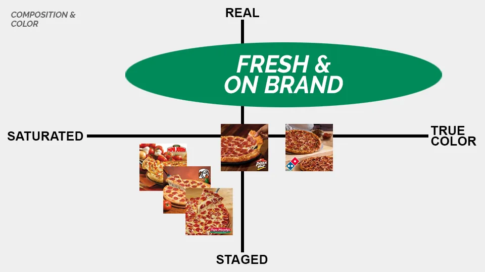
Brand principle chart “Composition & color”: pizza imagery plotted from staged to real and saturated to true color, with “Fresh & on brand” in the real, true-color corner.
Composition and color
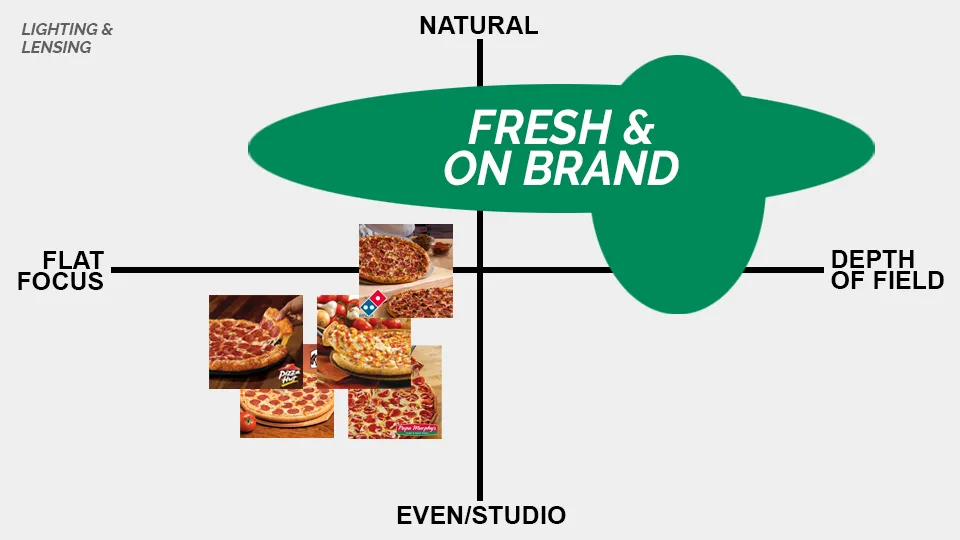
Brand principle chart “Lighting & lensing”: pizza imagery plotted from even studio light to natural and flat focus to depth of field, with “Fresh & on brand” in the natural, depth-of-field corner.
Light and lens
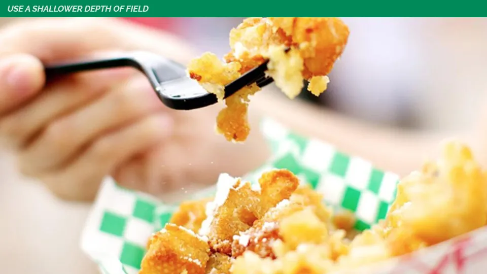
Brand principle “Use a shallower depth of field”: a forkful of food in sharp focus with a soft background.
Depth of field
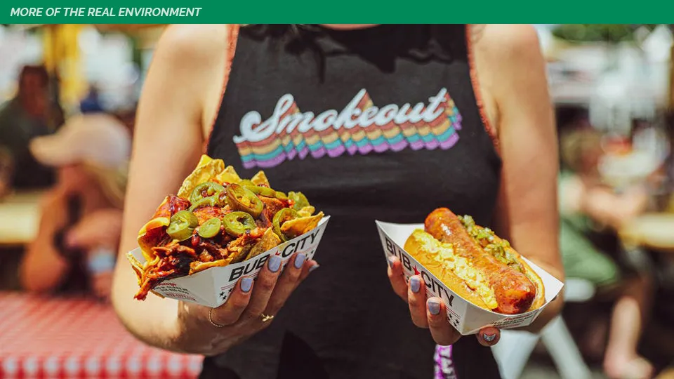
Brand principle “More of the real environment”: a person holding food at a busy, colorful outdoor event.
More environment
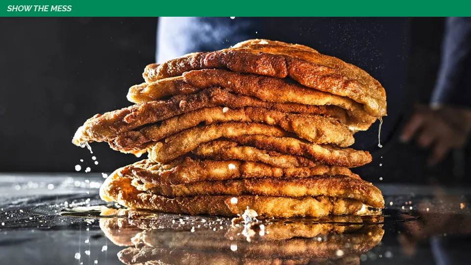
Brand principle “Show the mess”: a dripping stack of fried dough with crumbs on a dark surface.
Show the mess

05My role

Role
Senior Art Director. Led visual strategy and art direction for the rebrand.
Agency
WongDoody
Work
  • Visual strategy
  • Brand principles
  • Video